 Drake Durflinger
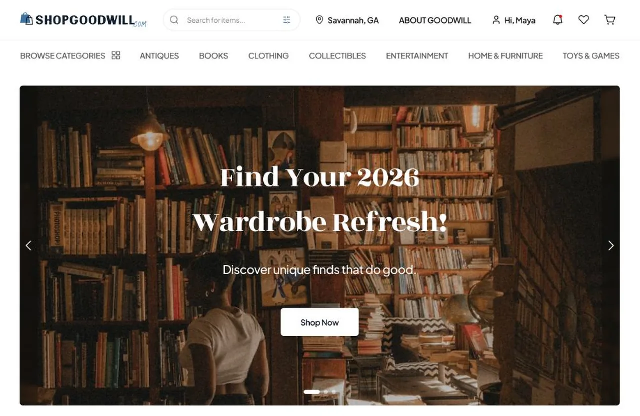
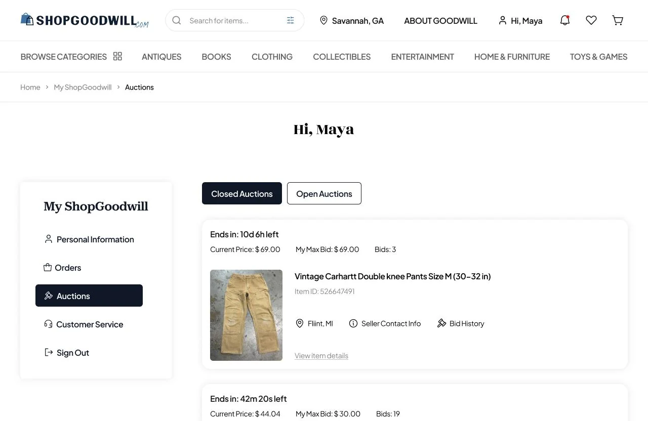
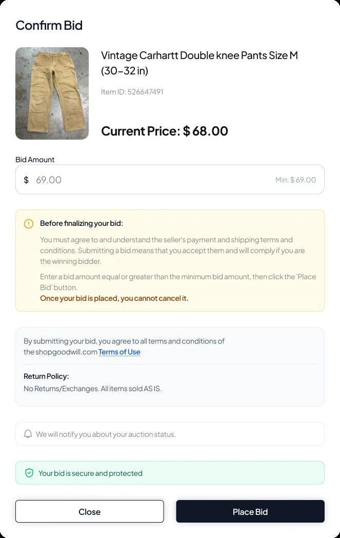
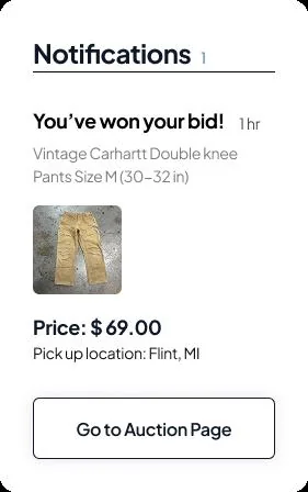
ShopGoodwill.com IA redesign · Case study · 2026
Thrifting without the frustration.
People couldn’t find things on shopgoodwill.com. Our team rebuilt its categories from thirty top-level menus to seven, and tested them twice in a tree-test tool Kate and I built, the tool that became TreeTestAi.
01
What it is
ShopGoodwill is Goodwill’s online auction marketplace. Its shoppers had trouble finding items because of confusing navigation, naming and hyper-specific categories: thirty top-level menus and more than 250 category menus beneath them.
We set out to rebuild the information architecture around how people actually look for secondhand things, and to prove the new structure worked before anyone designed a screen.
02
My part
“My team spent hours reverse-engineering ShopGoodwill’s category structure,” I wrote at the time. I was one of the team’s researchers: I ran interviews and field visits to Goodwill stores, ran the card sorts and the tree tests, and helped with the usability tests, the UX audit and the heuristic evaluation. Between us we ran an open card sort with 6 people and a closed sort with 3, timed 3 people on 3 tasks in the live site, watched shoppers in a store, and surveyed 43 people on the site’s wording.
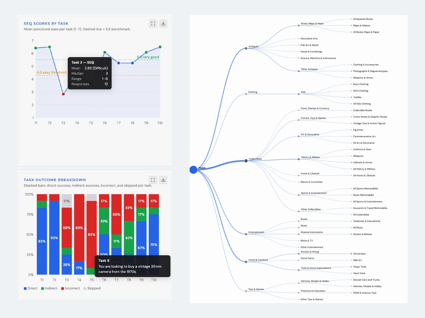
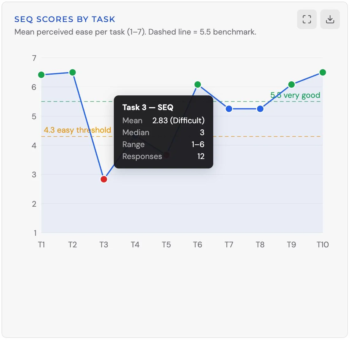
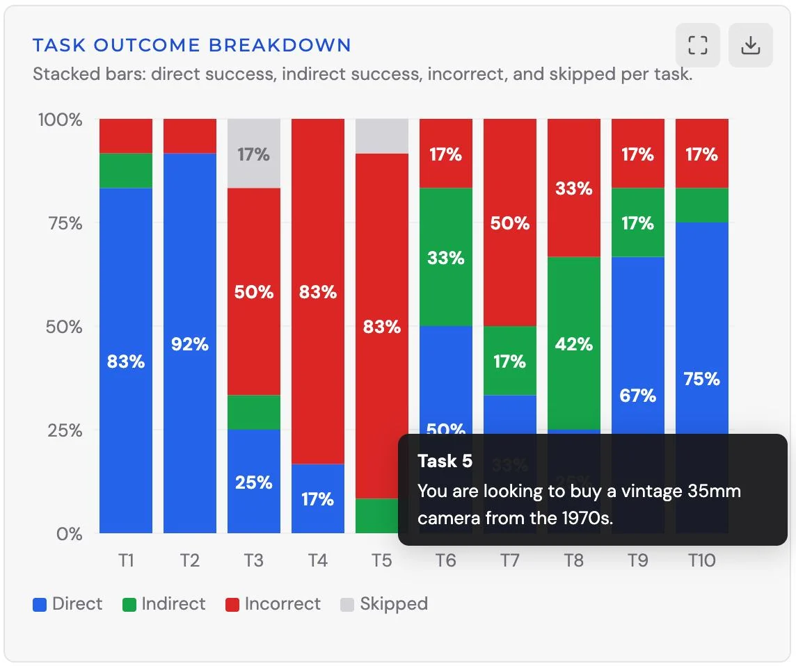
To test the new tree we didn’t rent a tool. Kate and I built one, a card sort and a tree test with a dashboard of ease scores, outcome bars and a click dendrogram, run from Kate’s site. The day before our first round we wrote the plan to turn it into a general platform. That became TreeTestAi.
03
What we found
-
Heuristic evaluation · severity 4 of 4
Favorites lived under “My ShopGoodwill”, not the account menu, and searching “favorites” returned an error page.
The site’s structure was working against people even when they knew what they wanted.
-
Usability test · live site · 3 participants
Finding the lowest-priced item in fraternal organizations took 3 minutes 37 seconds.
Hyper-specific categories turned simple tasks into hunts.
-
Tree test · round 1 · 12 participants
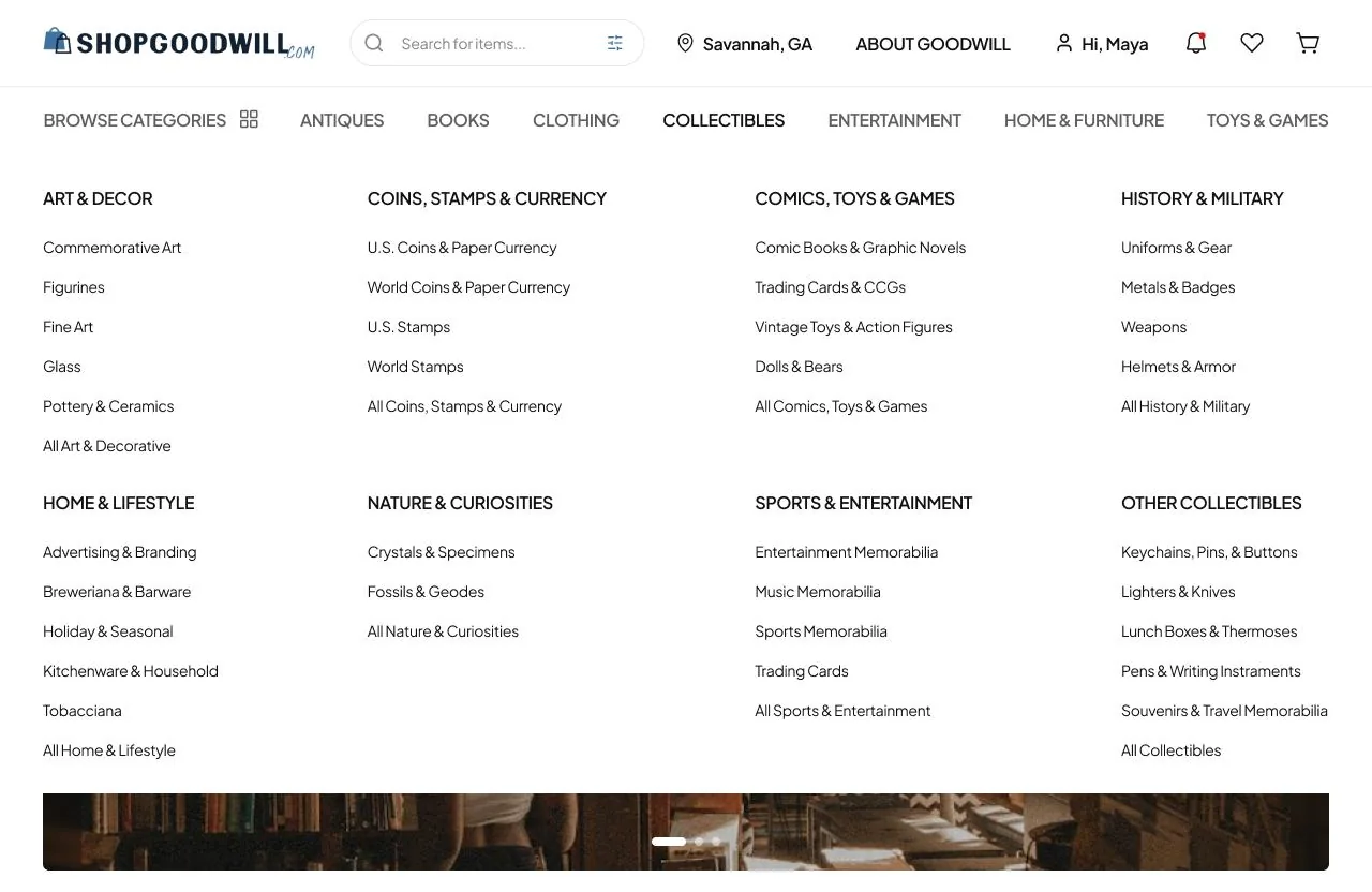
Antiques and Collectibles were the labels people flagged most; the line between them was unclear. A diecast model car failed in every version we tried.
Some problems were mental models, not menu depth, and moving branches couldn’t fix them.
04
What changed
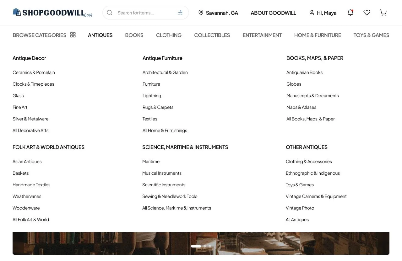
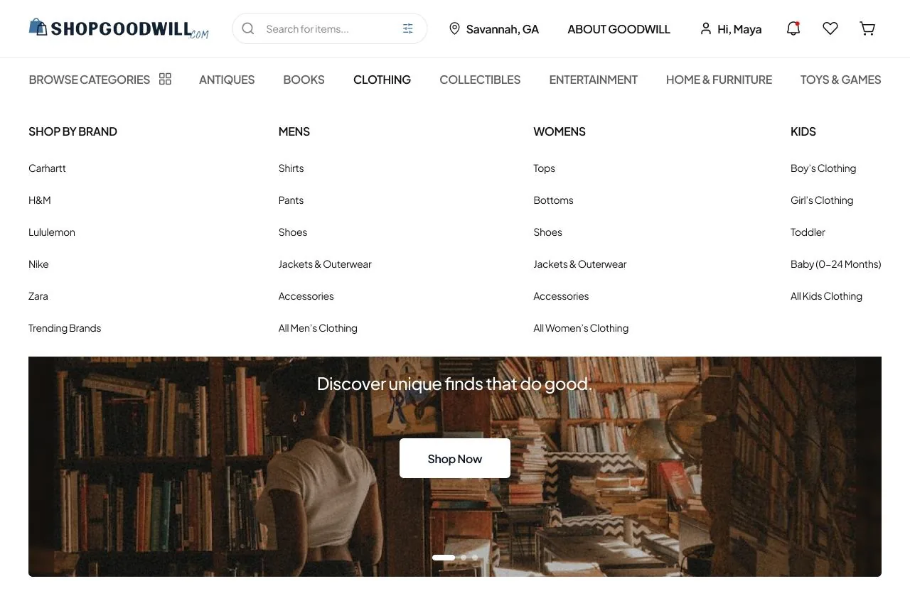
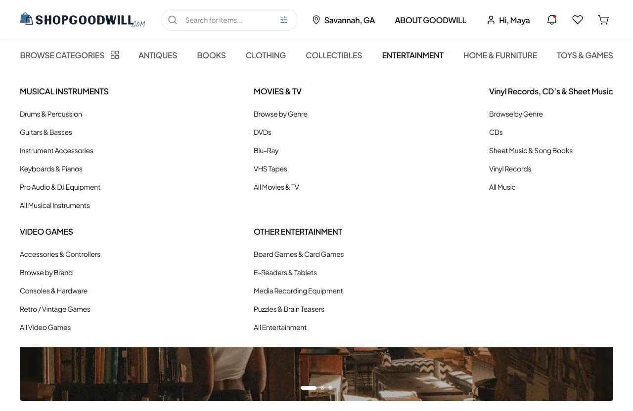
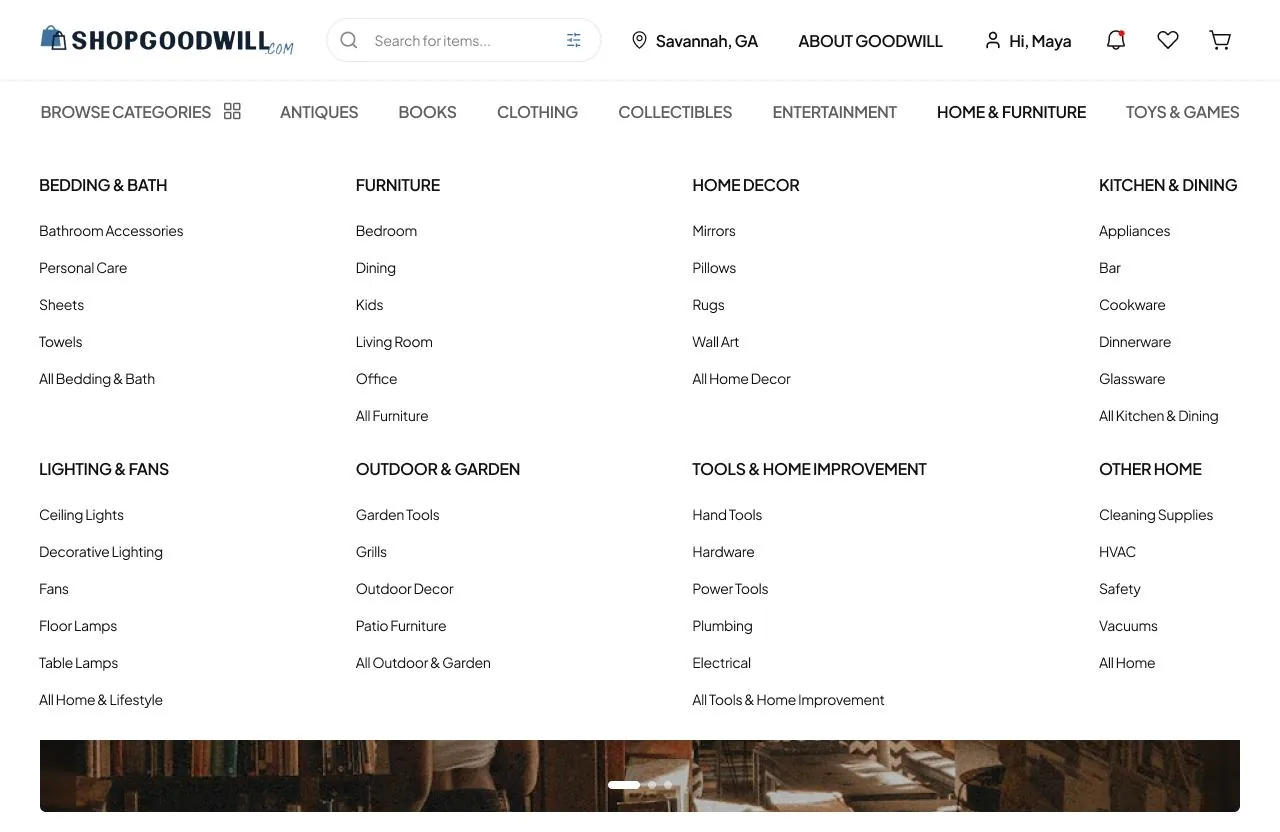
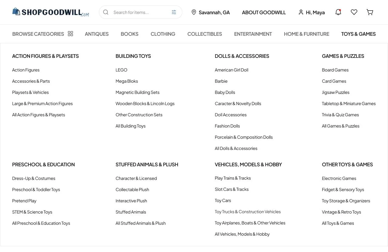
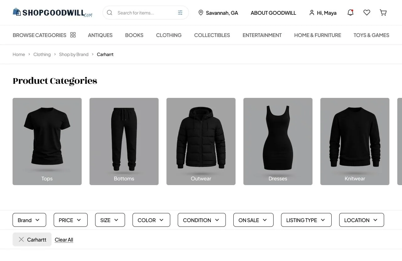
We cut the site to seven top-level categories, 46 subcategories and 253 below them, and tested it unmoderated in two rounds, 12 people then 7. Between rounds we moved one thing that mattered most: Books, out of Entertainment and up to the top level.
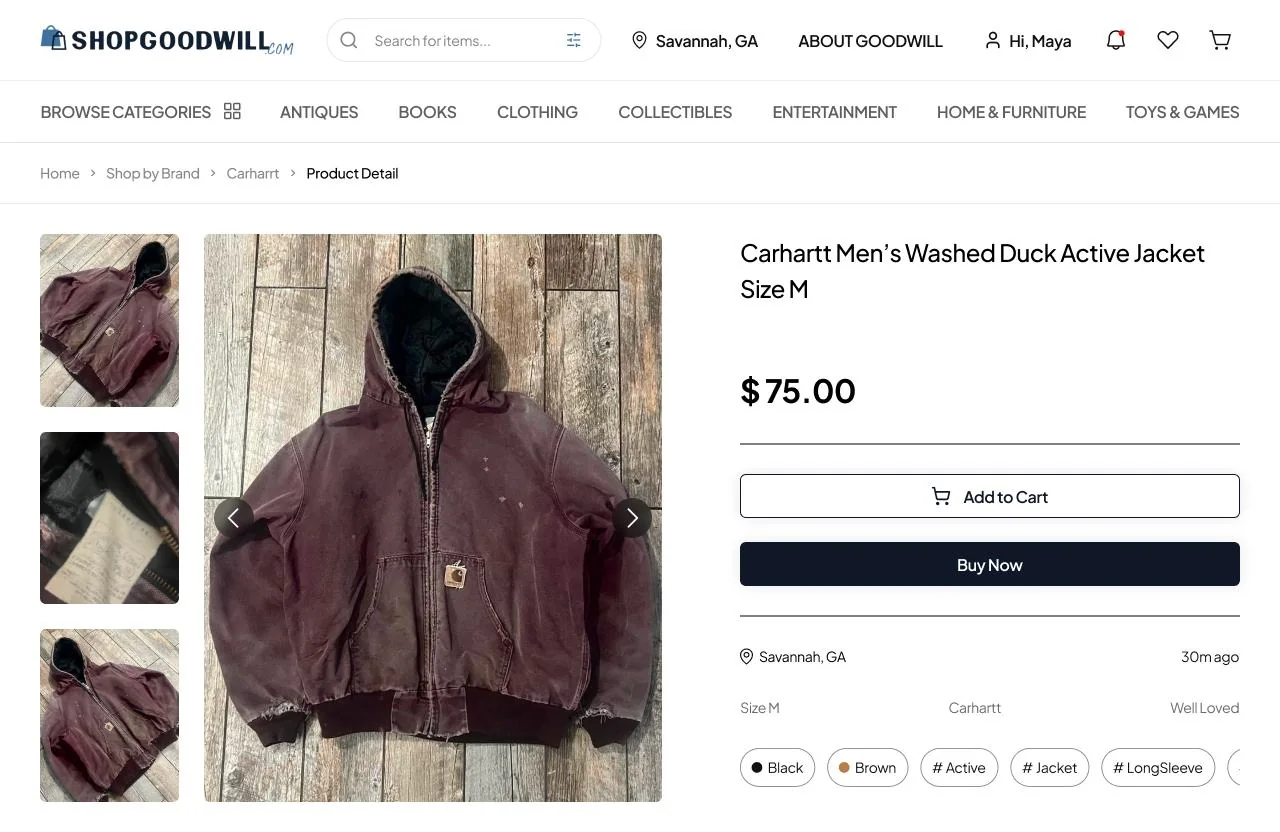
The honest result: overall success rose from 60.8% to 64.3%, short of the 80% we’d set ourselves. Three tasks got worse in round 2. We wrote six recommendations, starting with keeping Books at the top and settling the Antiques versus Collectibles line, and designed the new navigation in high fidelity.
- 30 → 7
- Top-level categories, from the live site to our tree.
- 33% → 100%
- Found the textbook after Books moved up, in 9.2 seconds instead of 41.5.
- 2.8 → 6.9
- How easy that task felt, out of 7, from round 1 to round 2.
05
Visuals
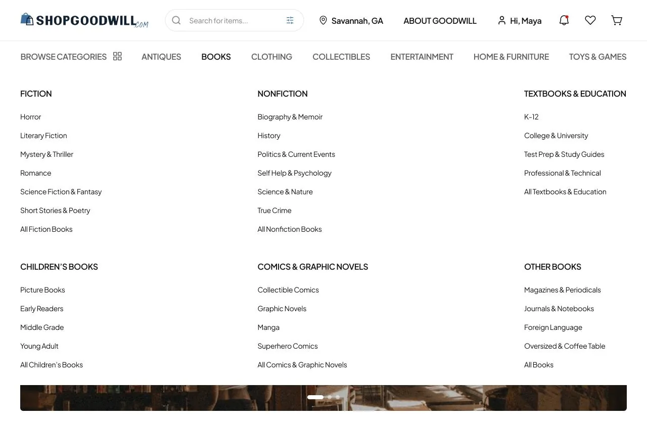
Student project for SCAD UXDG 360, not affiliated with Goodwill. Screens are from our team’s Lookbook; charts are from our own tree-test tool; participant data is not shown.