 Drake Durflinger
Amazon checkout psychology · Case study · 2025
Persuasion, or manipulation?
A solo ethics review of Amazon’s Subscribe & Save checkout: four psychological principles at work on one product page, the ethical question each one raises, who’s affected, and how to keep the nudge honest.
01
What it is
Psychology shapes how people use products, and Amazon’s checkout uses it well. I took one real purchase, a 12-pack of protein bars on the iPhone app in January 2025, and looked at how its Subscribe & Save flow guides the decision.
The question running through it: where does persuasion end and manipulation begin? It builds on Louis-Xavier Lavallée’s Growth.Design case study of Amazon’s purchase experience, which this project follows and credits.
02
My part
A solo project. I captured the flow on my own phone, tied four principles to the exact interface elements that use them, wrote the ethical question each one raises, mapped who’s affected by power and impact, and closed with recommendations.
03
What I found
-
Anchoring
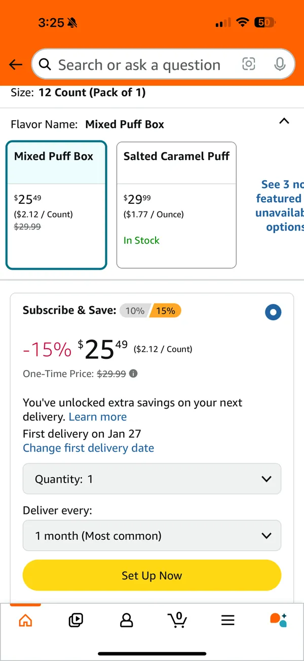
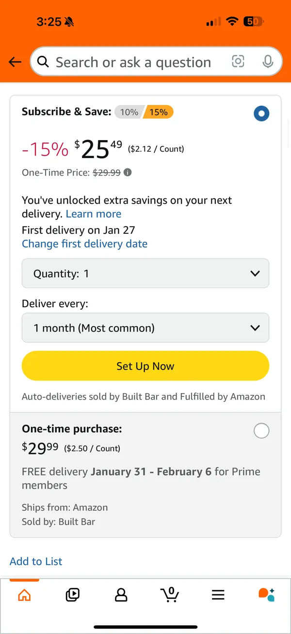
$2.12 a bar, next to a struck-out $29.99, makes $25.49 feel small.
Does this mislead users about the true cost?
-
The endowment effect
“FREE delivery Thursday, January 23. Order within 5 hrs 8 mins.” The bars feel like yours before you’ve paid.
Does this exploit emotional bias?
-
Fitts’s law
The subscription settings take up more than a third of the screen, with a big yellow button; the one-time purchase sits below them.
Does this nudge users into unintended subscriptions?
-
Social proof
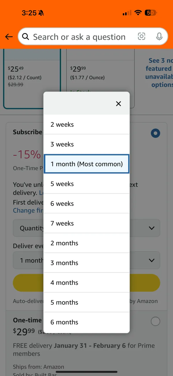
The delivery frequency defaults to “1 month (Most common)”.
Does this pressure users into conforming?
-
Stakeholders · power and impact
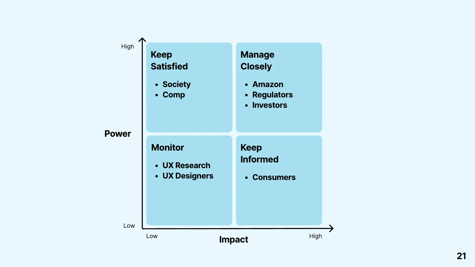
Consumers carry the most impact and the least power: they face the nudges, the social pressure and the hard-to-cancel subscriptions.
Amazon, regulators and investors need managing closely. Amazon’s own risk is a backlash that costs it trust.
04
What I’d change
This was an analysis, not a redesign. My recommendations keep the persuasion and lose the pressure: be transparent about pricing and options; make the difference between a single purchase and a recurring one clear; and show the delivery frequencies fairly, without a “most common” thumb on the scale.
- 4
- Principles, each tied to a specific element on screen.
- 4
- Stakeholder groups, mapped by power and impact.
- 3
- Recommendations: transparency, clear distinction, pressureless options.
05
Visuals
Student project for SCAD UXR 350, not affiliated with Amazon. Screenshots are mine, from January 2025. Builds on L.-X. Lavallée, “The psychology behind Amazon’s purchase experience”, Growth.Design (2022).