 Drake Durflinger
Duolingo heuristic evaluation · Case study · 2025
Fun and engaging, but not flawless.
A solo heuristic evaluation of Duolingo’s iPhone app. I went through the home screen, lessons, profile, settings and pop-ups against Nielsen’s ten heuristics, rated every issue on a four-step severity scale, and proposed a fix for each.
01
What it is
Duolingo is a gamified language-learning app with more than 500 million downloads, over 40 languages, and rewards for practice: XP, gems and streaks. It’s free, with a paid tier called Super Duolingo. Its users are casual learners, travellers and students.
I reviewed it the way a team would before a redesign: against established usability principles, ranked by what to fix first.
02
My part
This was a solo project. I used the app as a learner and took screenshots as I went, then checked five areas (home, lessons, profile, settings and pop-ups) against Nielsen’s ten usability heuristics.
Each issue got a severity on a four-step scale, from cosmetic (fix it if there’s time) to catastrophic (it stops people finishing a task), and a proposed fix. I presented it as a design review on April 22, 2025.
03
What I found
-
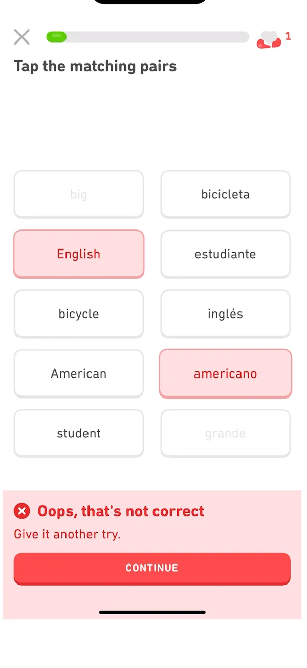
Heuristic 3 · User control and freedom · Big
In fast matching and multiple-choice rounds, a mistaken tap is checked the moment you make it, with no way to change it.
Fix: an “undo last choice” button, or let people change an answer before it’s checked.
-
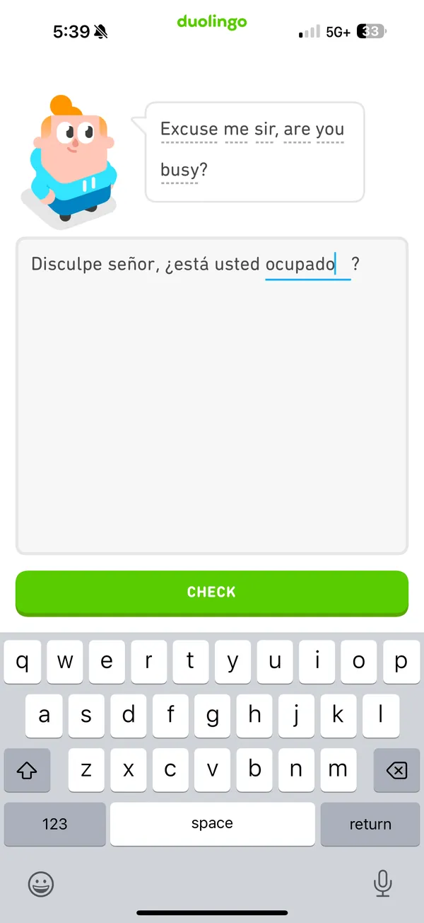
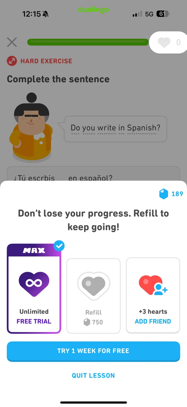
Heuristic 5 · Error prevention · Big
The app is strict about spelling and grammar: a near-miss is marked wrong and costs a heart, and running out brings a refill offer.
Fix: accept near-correct answers and say “Watch your spelling” instead of penalizing.
-
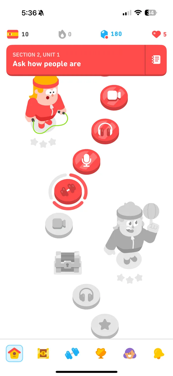
Heuristic 8 · Aesthetic and minimalist design · Big
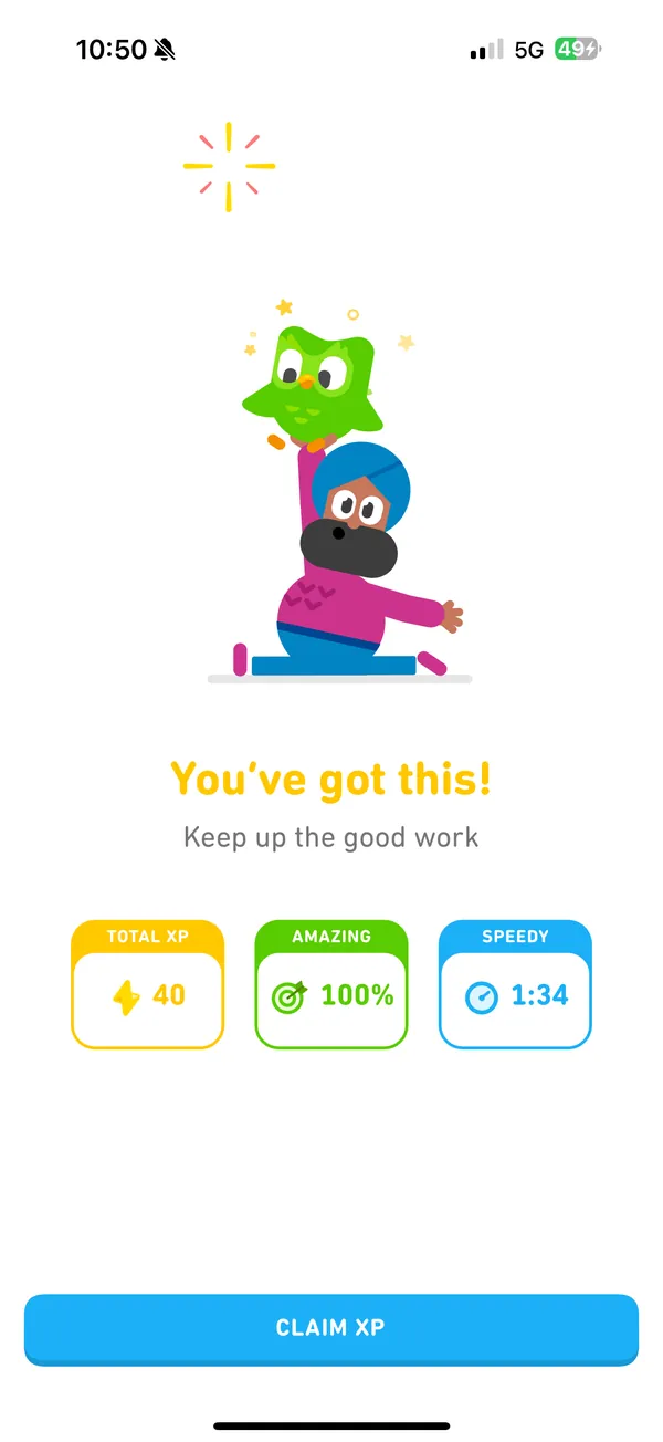
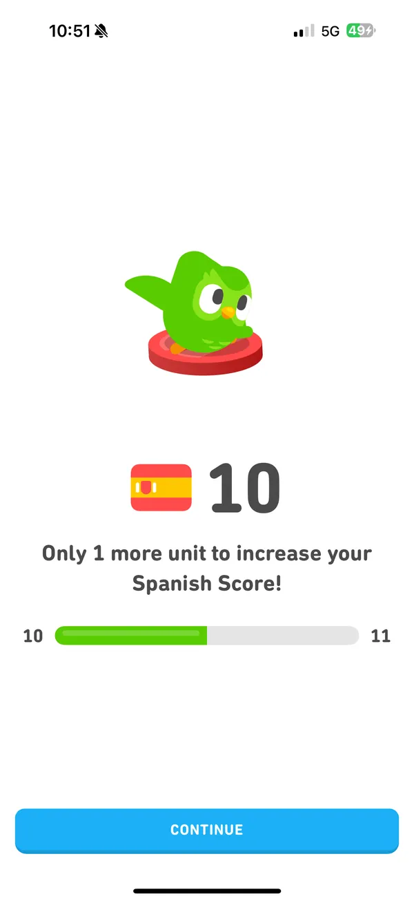
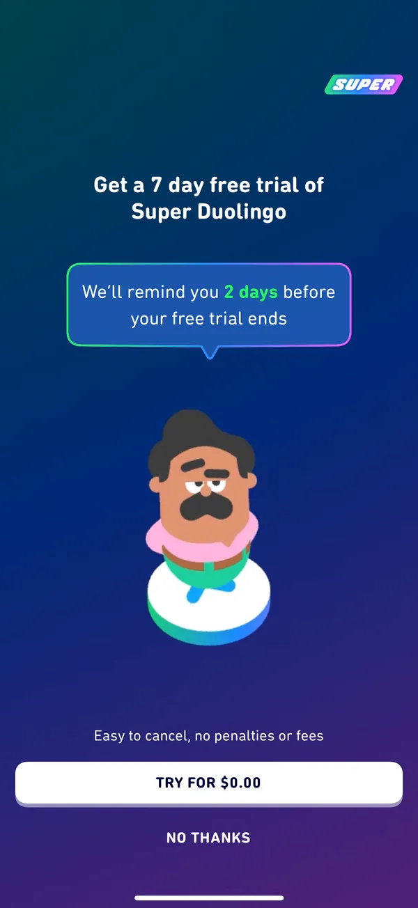
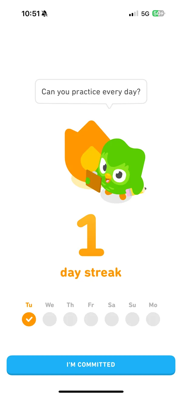
Finishing a lesson sets off a run of bright banners, buttons and offers before you’re back on the path.
Fix: combine XP, gems and “lesson complete” into one clean banner.
-
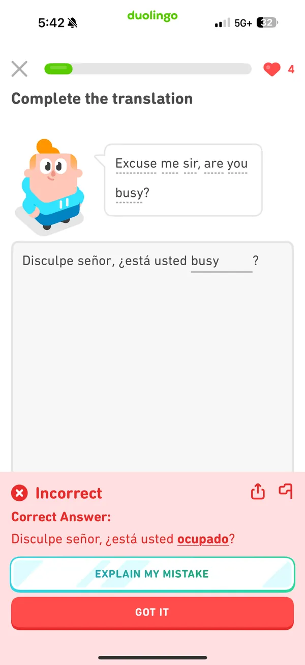
Heuristic 9 · Recognize, diagnose and recover from errors · Small
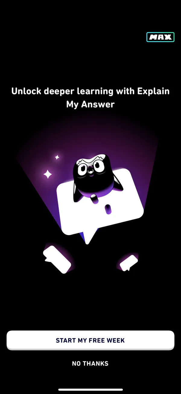
A wrong answer gets a red X and the correct answer, but no explanation. “Explain my mistake” opens a paywall.
Fix: light, in-context feedback without paying for the full explanation.
-
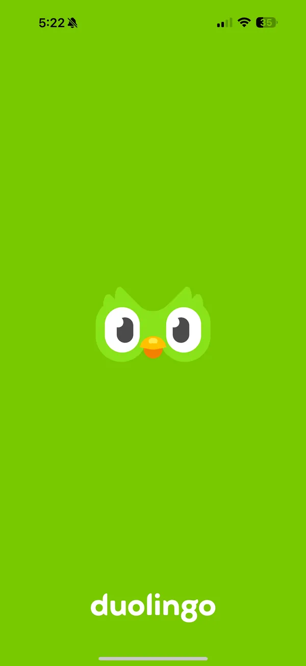
Heuristic 1 · Visibility of system status · Small
When the app first boots, the green screen gives no sign that it’s loading.
Fix: the loading animation the app already uses in other places.
-
Heuristic 10 · Help and documentation · Small
To see a translation you have to tap the specific word, which is easy to miss.
Fix: a help button for a quick translation.
04
What I’d change
This was an evaluation, not a redesign, so nothing shipped. My recommendations: let people undo a choice in fast rounds, soften the spelling check so learning wins over punishment, fold the post-lesson screens into one banner, give clearer in-context feedback on mistakes, and put help inside the lesson.
Most of the issues were small or medium, the kind that wouldn’t take a large change but would have a high impact. What I took away: minor issues hurt usability more than you’d expect, and a heuristic evaluation is a fast way to find them early.
- 6
- Issues across home, lessons, profile, settings and pop-ups.
- 3
- Big issues, the ones to fix first.
- 0
- Catastrophic. None stopped me finishing a lesson.
05
Visuals


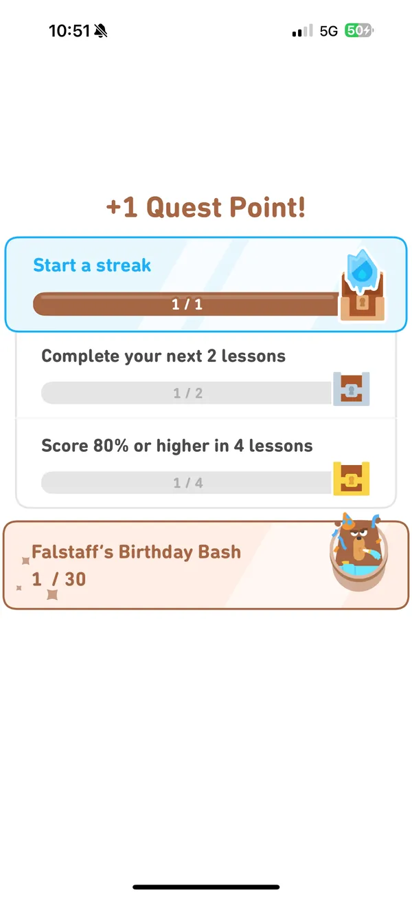
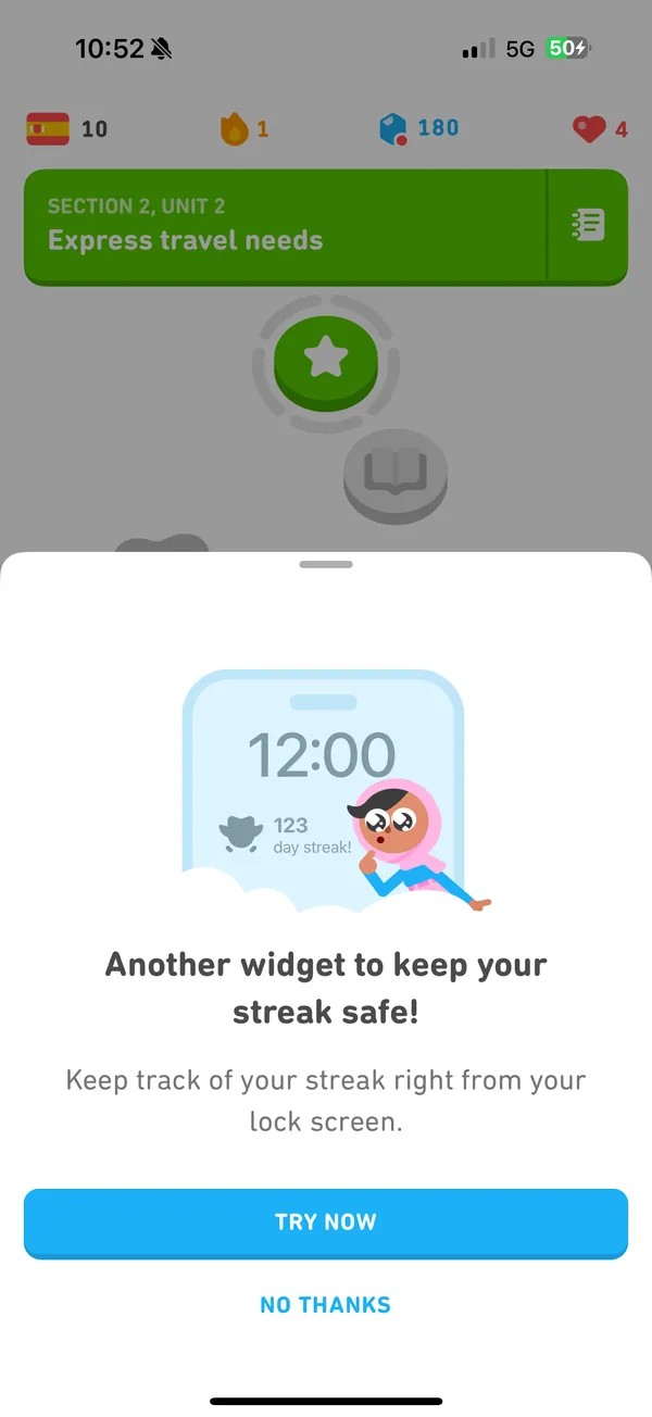
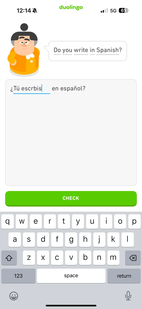
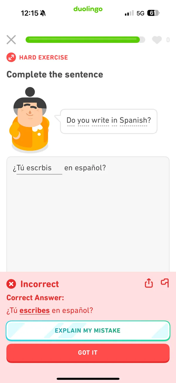
Student project for SCAD UXR 250, not affiliated with Duolingo. Screenshots are mine, from my own lessons in April 2025.