 Drake Durflinger
COSMOS.so redesign · Case study · 2026
Designers collected on Cosmos, then left to do the real work.
Creative pros saved images on Cosmos, then moved to Figma to group, annotate and present them. Our redesign put groups, notes and a PDF export right where they were leaving, in a prototype we vibe-coded instead of drawing in Figma.
01
What it is
Cosmos is a curated, image-first inspiration platform for creative professionals. The people who use it like it for real reasons: the image quality, See Similar, and the Chrome extension.
But the workflow leaked. Designers lost their place while exploring, left Cosmos to organize, and lost the thinking they’d built the moment they exported. Organizing meant entering a separate mode, and an image moved into a sub-collection disappeared from the main board. A note was its own tile, never attached to an image, and export was a zip of images.
02
My part
We mapped the current state before talking to anyone: a heuristic evaluation against Nielsen’s 10 and a UX audit of 8 page types, plus a site audit I ran with one of my own agent frameworks. They logged 41 audit findings and 31 heuristic findings, including 65 of the homepage’s 68 buttons with no label.
Then we went to people: interviews across nine design disciplines, from students to a creative director and a photographer with 25 years in the field, and three rounds of shadowing and testing, moderated and unmoderated, on a Nike NYC pop-up mood board. One rule: if they get stuck, let them stay stuck. Everything went into one affinity dataset: 342 notes, 48 codes, 5 friction themes. That pipeline is the ancestor of TreeTestAi, which now automates it.
The biggest research call came first. We started on Yelp and dropped it two days in, because Yelp’s problems were structural, not UX: Google owns its distribution, users have no lock-in, and its ads are expensive for small businesses. We moved to cosmos.so, a product a redesign could actually reach, and rebuilt the audits, screener, survey and interview script in about 48 hours.
I led the prototype. Most teams hand in a Figma mockup; we were one of the more leading-edge teams to vibe-code a working site instead: Claude Design for the flow, Cursor for the visual style, and Claude Code for every change after that, from v3 to v26. Testers got the real micro-interactions, and testing started early, so the back half of the project went to refining the redesign, not building it.
03
What we found
-
Usability test · Round 2 · after the grouping task
It would kind of make more sense to have the board and like show them in groups instead of like their own separate thing.
The fix wasn’t better folders. People wanted groups on one board, so sub-collections became inline groups.
-
Interview · P4 · senior UX, agency
Not just pulling in the raw images. You also have to synthesize the information and show your work. Sticky notes are a big one and then grouping and theming is really important too.
A mood board is an argument, not a pile, so notes and themes had to sit on the images themselves.
-
Interview notes · P8 · fashion design student
There’s a disconnect between collecting inspiration and actually using it in my work. I have to manually transfer everything, which slows down the process.
Export had to carry groups and notes out with the images. A zip of images leaves the thinking behind.
04
What changed
The wall narrowed to three moments, Collect, Compose and Present, and changed five things:
- Groups, not sub-collections. Organize mode is gone. Drag or shift-click an image into a group and it stays on the main board with a tag.
- Notes on the image. Every image gets a note and every group a caption, so the board carries the reasoning.
- Export that keeps the thinking. A branded PDF with groups, notes and themes replaced the zip, and every export is archived.
- Noticed Themes. It names the designers, eras and influences a collection already shares: AI for understanding, not for push.
- Breadcrumbs. A thumbnail trail back to where you were, adapted from public.work (a Cosmos product), instead of hammering the back button.
It’s a class prototype, not a shipped Cosmos feature.
- 342 → 3
- Notes on the wall, narrowed to three moments: Collect, Compose, Present.
- 5
- Features built from the findings into a working, vibe-coded prototype.
- 56 → 91
- System Usability Scale: live Cosmos, then our redesign.
05
Visuals
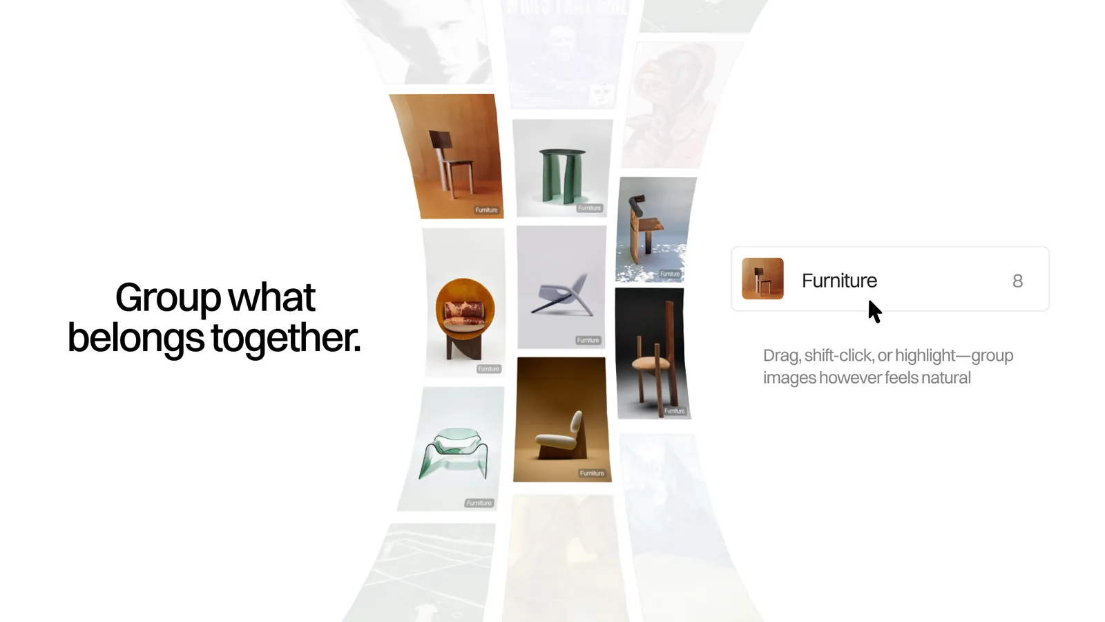
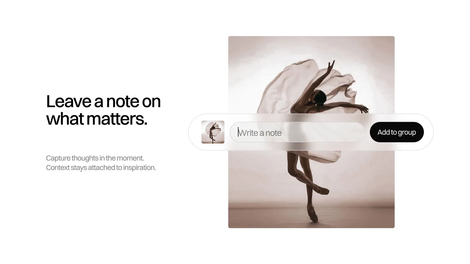
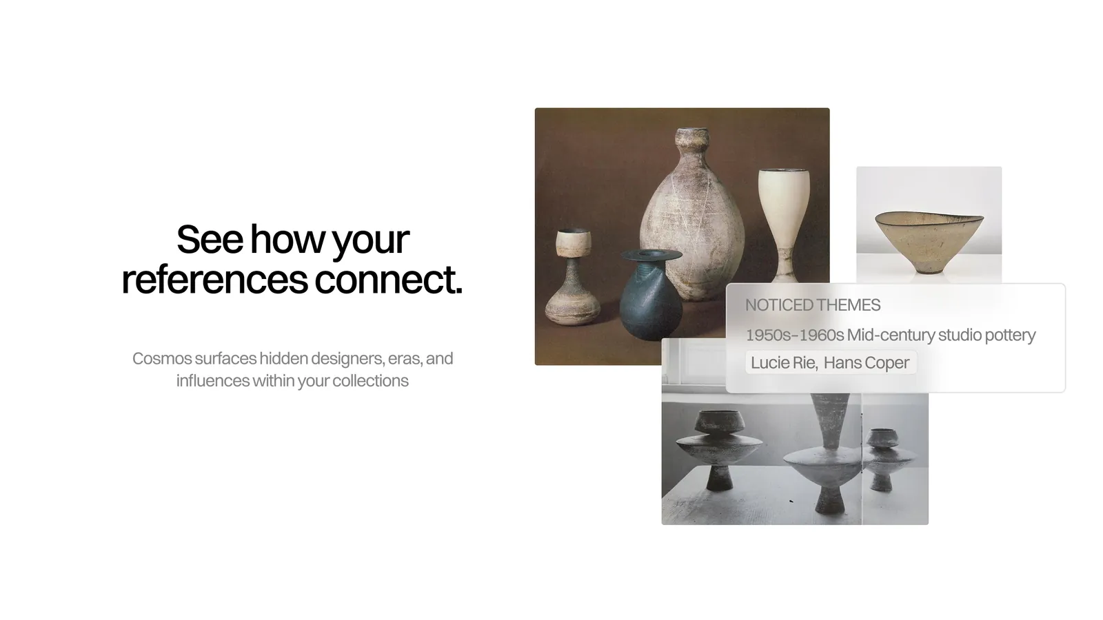
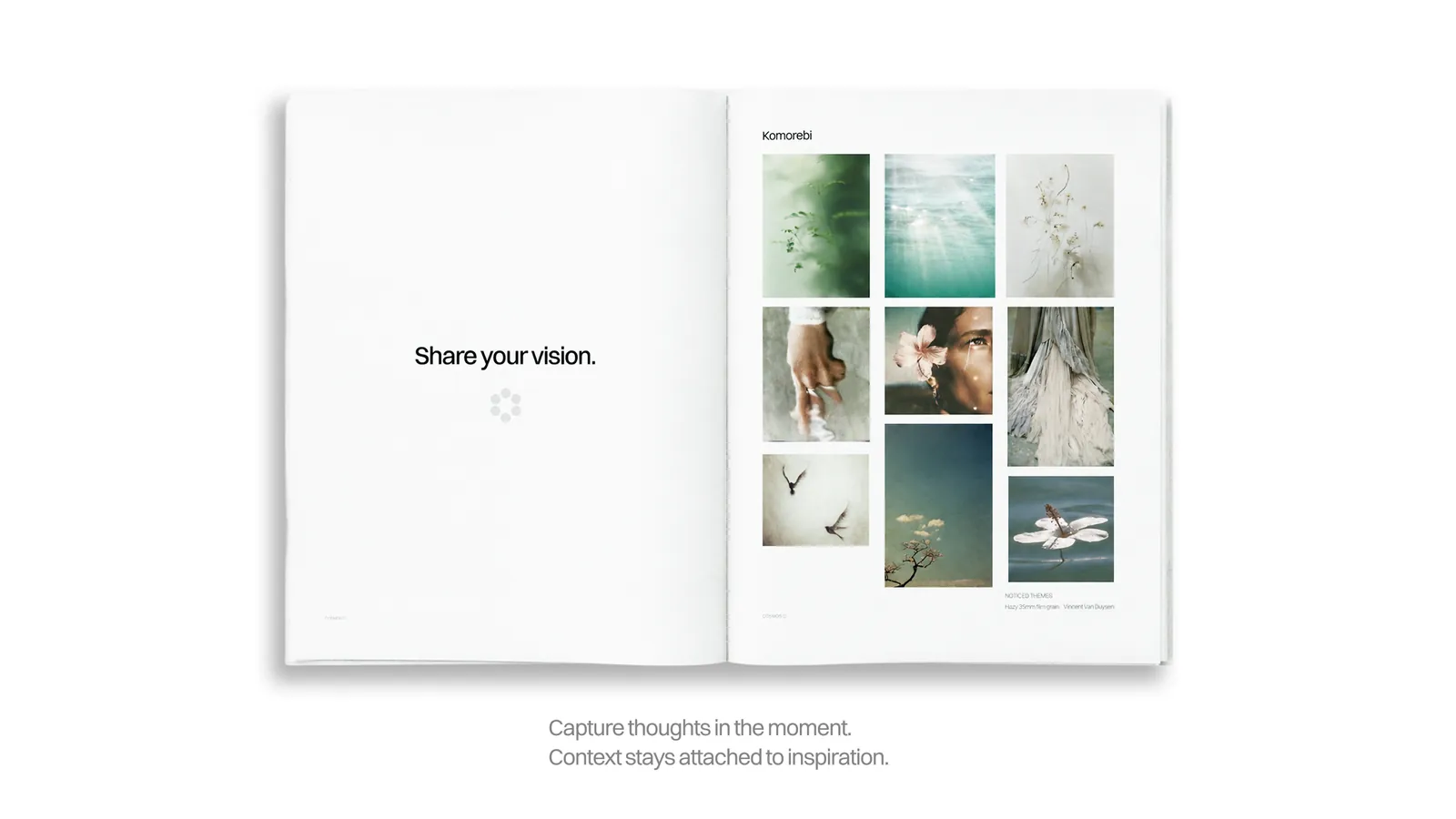
Hero shots: Jack Morris, Aiyanna Canty and me. Images in the prototype were saved from cosmos.so.