 Drake Durflinger
Soteria · Case study · 2025 · Red Dot Design Concept Award 2026 · IDEA 2026 Finalist
Deciding what not to show a firefighter.
Crews inside a fire and commanders outside it work from cluttered radio and no shared picture. Interviews with seven Savannah firefighters showed the real problem was cognitive overload, so we designed Soteria to show less.
01
What it is
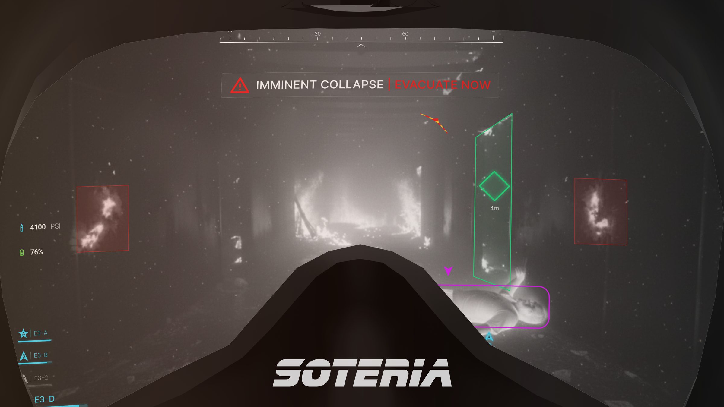
The mask, for the crew inside
Thermal view, navigation and team data in the field of view, with collapse warnings when they matter.
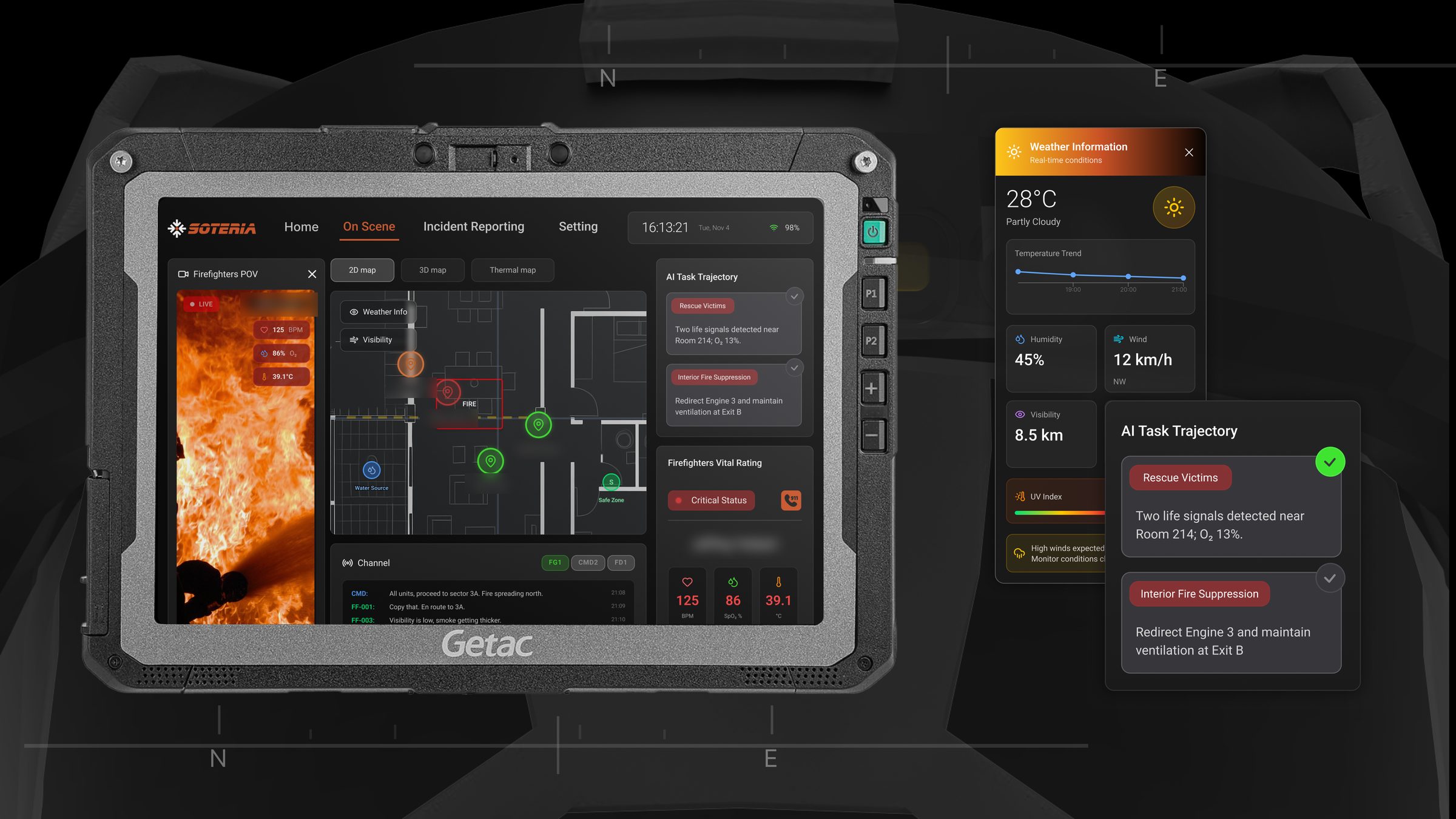
The tablet, for command outside
Live crew positions on a 2D/3D building map, vitals, a POV feed and AI-suggested next actions.
02
My part
I was the research lead on a team of five. A teammate modelled the mask, and I didn’t design the screens; I decided what they had to be true to.
- FramingOwned the problem framing and the How Might We statements, cut from five at midterm to three for the final.
- EvidenceGrounded the concept in real injury and cost data (NFPA, NIST) instead of assumptions.
- InterviewsSeven Savannah firefighters in two sessions, a 4-year advanced firefighter to a 23-year captain. I did the outreach to firefighters and led the interviews and much of the observation.
- Synthesis500+ raw data points on an affinity wall, a shift mapped from dispatch to debrief, a card sort for the tablet’s navigation. I did most of the affinitizing.
- Field testTook one script and three tasks to Fire Station 3 so firefighters, not us, could answer “does this feel like too much?” I led it.
03
What we found
-
Interview · Savannah firefighter
Critical transmissions on the radio can be hard to hear… radio traffic gets very cluttered and you end up missing things.
The affinity wall traced the visibility and radio complaints to one root cause, cognitive overload. So we stopped adding tools and aimed to cut the load.
-
Field test · Fire Station 3 · 5 testers
2 of 5 testers said the system wasn’t simple. Turning on one firefighter’s thermal view from the tablet exposed hierarchy confusion.
The tablet’s structure didn’t match how command works, so we rebuilt it: unit first, then firefighter, then mask settings.
04
What changed
We stopped calling Soteria an AR mask and started calling it a cognitive load management system, and that changed what we built.
- Red Dot + IDEA
- Red Dot Design Concept Award 2026, and an IDEA 2026 finalist (IDSA’s International Design Excellence Awards). Won as a team of five.
- 5
- Changes to the prototype after one round of field testing at Fire Station 3.
- 500+ → 1
- Raw data points from seven firefighters, traced to one root cause: cognitive overload.